
Innovating Lead Generation, Serving Businesses & Marketers Worldwide

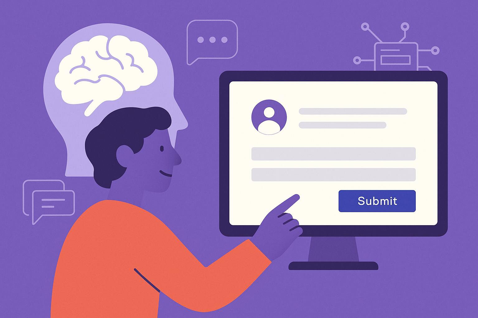
Every form on your website is more than just a bunch of fields—it’s a digital handshake, a bridge between interest and action. Whether you're collecting email addresses, running a contest, or qualifying leads, the difference between a successful campaign and a failed one often comes down to one thing: psychology.
Understanding how people think, what motivates them, and what deters them can significantly influence your form conversion rates. In this article, we’ll explore the psychological triggers behind high-converting forms and how you can use these insights to generate more leads, build trust, and boost conversions. We’ll also connect the dots to broader touchpoints like direct mail and clarify common mailing concerns—like what does c/o mean in mailing.
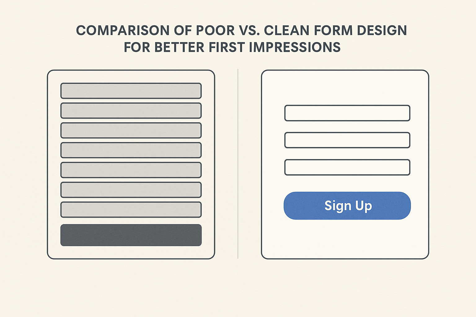
The moment a user lands on your form, they begin making judgments—often subconsciously. Clean, intuitive design is key. This principle applies across all digital experiences, from web forms to logo design. In fact, according to a study by Google, users judge websites as beautiful or not within 50 milliseconds.
Keep your form visually simple. Avoid unnecessary graphics or fields. Use whitespace to create breathing room and guide the eye. The less cognitive effort it takes to process the form, the more likely users are to complete it.
One of the strongest psychological principles in marketing is reciprocity. When someone gives us something, we’re inclined to return the favor.
Offer value upfront—like a free eBook, a discount, or a helpful checklist. This makes users more willing to part with their email address or personal information.
For businesses using direct mail campaigns, integrating digital forms with a Direct Mail API creates a seamless user journey. Send a personalized postcard with a special offer and a QR code linking to your form. Now you’ve given them something tangible—activating the reciprocity trigger.
We look to others when making decisions, especially under uncertainty. This is the principle of social proof, and it’s essential for optimizing lead generation forms.
When visitors see that others are engaging, they’re more likely to do so themselves. Highlight your credibility next to the form whenever possible.
Every field you add to a form creates friction—an opportunity for the user to abandon the process. Psychological studies have shown that the more decisions a person has to make, the more likely they are to disengage.
Ask only for what’s necessary. If the user's name and email suffice to deliver value, don’t ask for a phone number or job title. Use multi-step forms to break long forms into digestible chunks. This “progressive disclosure” technique keeps the user’s momentum going without overwhelming them.
Ambiguity creates anxiety. If a user doesn’t understand what’s being asked, they’ll either guess (leading to bad data) or bounce.
One commonly misunderstood aspect of forms that involve mailing addresses is how to format the recipient's information. For instance, users might ask, what does c/o mean in mailing? It stands for "care of", and it’s used when you’re sending mail to someone at someone else’s address—say, John Smith c/o Jane Doe.
To help users enter their information correctly, consider linking to helpful resources like this guide on how to use c/o in mailing addresses.
You could even implement address validation or hints using a third-party tool, especially if you’re integrating with platforms like a Direct Mail API to send physical materials. The smoother the data input experience, the higher your form completion rate.
Psychological studies have repeatedly confirmed that urgency and scarcity increase conversion. People are more likely to act when they fear missing out.
But always be honest—false urgency can damage trust.
Personalized experiences lead to higher engagement. Using cookies or past data, you can pre-fill forms or tailor the message based on the user’s behavior.
For example, if someone has visited your pricing page multiple times, your form copy can change to say:
“Looks like you're exploring our pricing—ready to get started with a custom quote?”
Even integrating your form with CRM or marketing tools via webhooks or APIs (including physical touchpoints through a Direct Mail API) can let you personalize follow-ups, increasing trust and conversion.
Microcopy—those small lines of text under fields—can have a major psychological effect.
These cues reduce hesitation and answer silent objections before they arise.
Humans process visuals faster than text. Directional cues like arrows, images of people looking toward the form, or bold colors can draw attention exactly where you want it.
A smiling face looking toward the call-to-action button can increase click-throughs by subtly guiding the user's eye. Even the shape and color of the CTA button matters—rounded edges and bold colors (like green or orange) tend to convert better.

When asking for sensitive information, trust is everything. A user is making a silent judgment: “Can I trust you with my data?”
And if you’re offering a service that involves addresses or physical mail, educating users about terms like what does c/o mean in mailing helps demonstrate transparency and expertise. This builds confidence in your brand.
High-converting forms are not just about clever copy or fancy design—they’re about understanding people. When you apply proven psychological principles, your forms become more than functional—they become irresistible.
Start by asking:
And don’t forget to connect the dots between digital and physical interactions. Integrations with tools like a Direct Mail API can bridge the online-offline gap, reinforcing your message and nurturing leads across multiple touchpoints.
When you combine smart design, clear messaging, and psychological insight, your forms won’t just collect data—they’ll convert visitors into loyal customers.